We hope that you have enjoyed looking at our blog and seeing how our work has progressed from start to finish. Overall, we feel that the work that we have achieved has been quite successful and work well together. All posts are individually labelled so that they are easy to locate and the music player helps set the mood and genre of our band. The additional gadgets such as the weather application came in very useful for us and the popular posts also helped as we could identify what sorts of posts were most successful and why. This way we could make further improvements at continue working at that standard. We have also added links to websites which we found useful and got inspiration from for the making of our final music video and ancillary texts. Our skills with software and analytical skills have improved dramatically and we feel a lot more confident particularly in the production stage.
In what ways does your media product use, develop or challenge forms and conventions of real media products?
In the research and planning stage I identified the common indie conventions used in real media products and I decided how I would incorporate these into my own ancillary texts and music video. I researched these conventions on the internet and found out how they are used and why. Indie conventions are very different to other genres and these have an on-going theme which makes the genre so clear. I used the indie conventions but didn’t necessarily develop or challenge them as my ancillary texts were quite simple. The research and planning came in very useful as I could then decide which elements would look most effective and work well together to demonstrate our band’s genre. A few of the indie conventions I researched and used are listed below.
Lack of Colour
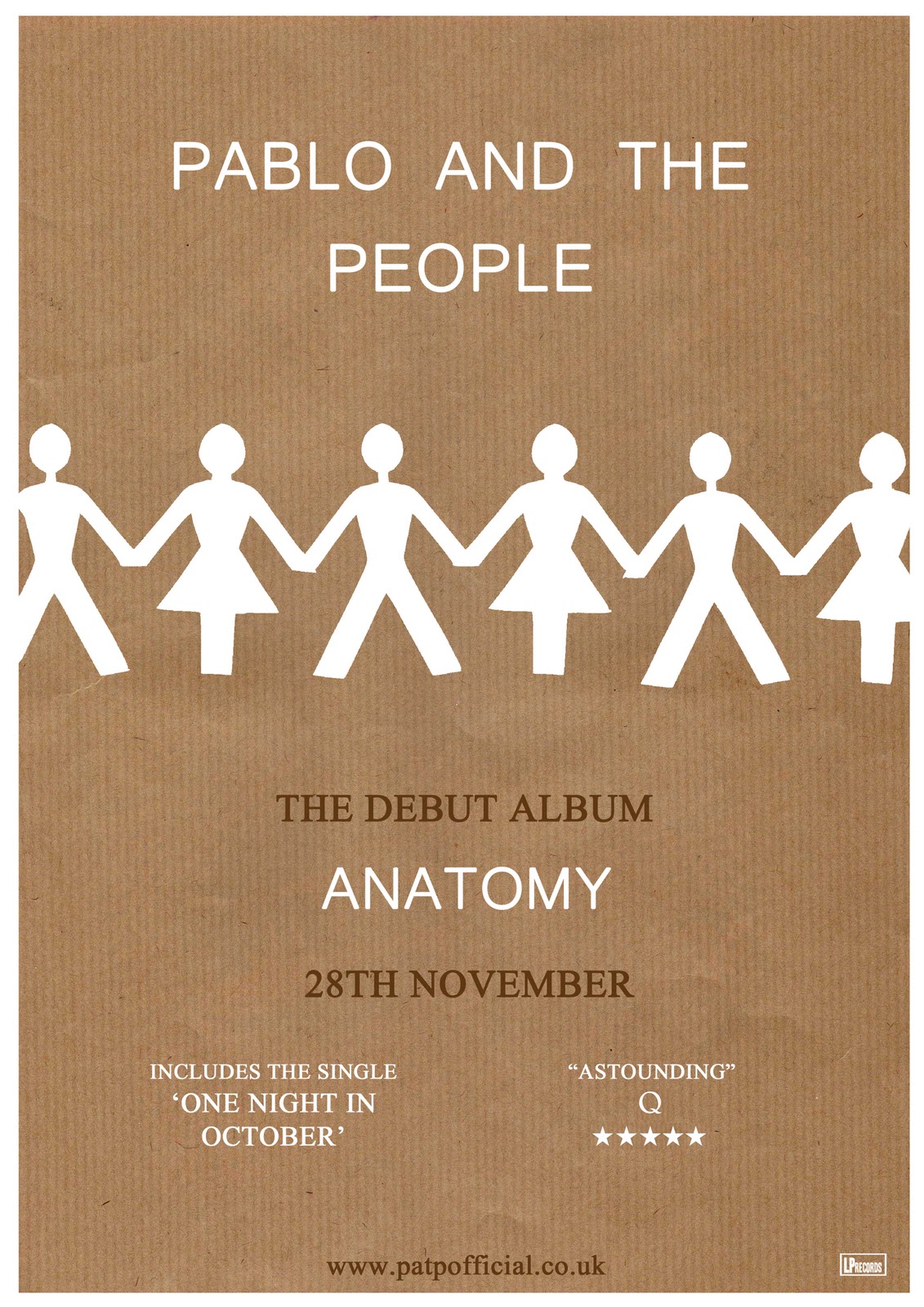
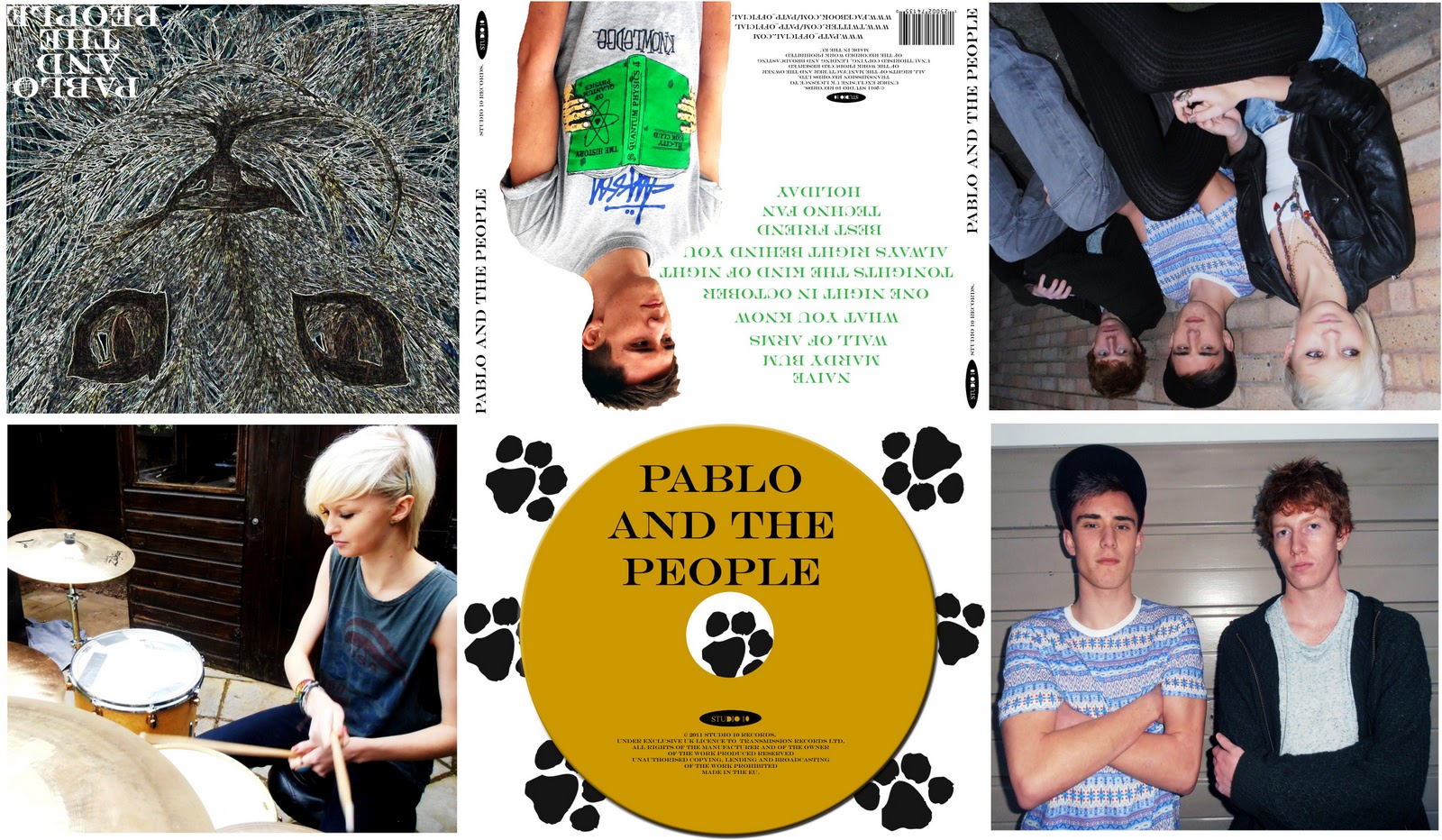
The first convention that was listed in the indie genre was the idea of having limited colour on the ancillary texts and music video. My ancillary texts didn’t have a very consistent colour scheme. This is quite common in real media products as some products are quite disjunctive and not always relevant to one another. This can work quite well depending on the type of band. Some bands may prefer a chosen colour scheme that can be used on both the digipack and magazine advert so that they can be recognised by this. There is no direct link between the uses of colour on both of my ancillary texts. For the magazine advert, the colours are quite dull and neutral. I edited the image itself so that colour was less bright and this is a common feature on other indie magazine adverts as they usually look quite vintage and colourless. The colours that are expressed work quite well together because they are not too vibrant so this does not distract you from any other aspects or create one main focusing point which was the aim. Black, white, blue and brown are the most noticeable colours on my magazine advert which complement one another as they are not too bright. The colours used on my digipack are slightly more vibrant and eye-catching. The colour scheme is quite consistent and in some ways is similar to the colours of the magazine advert but they are just used more. For example I used a mustard colour for the CD itself which links to another panel of the photograph of the drummer as the drums are similar colour so it ties the two in. I also used a similar blue colour as I used a photograph of the band members that was taken at the same time as I took the photo for the magazine advert so they were wearing the same clothes. Therefore I continued with the use of blue on a number of panels which enabled the colour scheme to be more consistent but still not too distracting. Black, white and green were also prevalent on my digipack which can also be seen on a number of the panels. Just like I did with the magazine advert, I edited the images so that the colours were less bright and the contrast was increased. This way the colours were toned down so creates the effect that other indie media products use.
Dark Location
For both ancillary texts, I used the same location to take my photographs. Therefore they had a link so that the band could be recognised on both products as they were also wearing similar clothes. The location was quite dark as the photos were taken on my drive next to the garage so this convention was clearly shown. This location is quite consistent in this particular genre therefore the band fit into the indie category just based on this because it is quite common. The editing I used on each of the photographs enhances the darkness of the location as the colour vibrancy was toned down and the contrast was increased. Therefore this makes the photos look more vintage and better quality. Our location used for the music video was also quite dark in the studio although additional lighting was used so this also relates to the ancillary texts.
Fast Paced
Another common indie convention used is fast paced shots in the music video. As our video was based solely on band performance we had to ensure that we had a lot of shots and also a variety of types of shots to keep the video interesting. This way we could vary the speed of shots so that it looks like other real products. Indie videos are usually quite fast paced as the songs are upbeat and up tempo. Therefore the shots are fast paced as so much is going on in the video. I used this convention to portray our three band members equally and express their personalities as they were doing a lot in the video whether it be acting, dancing, singing or playing the instruments. By including a lot of fast paced shots that fit to the speed of the song, it makes it more interesting to watch and meets the style of the indie genre. In thee video we included clusters of fast paced long shots, mid shots and close up shots where the tempo increases to create an interesting contrast. This can be seen in the clip below.
Costume
Costume is a very important convention to include in both the ancillary texts and the music video. The consistency of the band’s style entirely determines how well they will be recognised. As stated previously, the photographs for both the magazine advert and digipack were taken at the same time so they band members were wearing similar, if not the same clothes. Therefore they can be recognised for their indie style for future releases and appearances. For the band to fit into today’s music industry, I felt it was important for them to dress in a way that meets the indie category. This convention is used as our band wears similar clothes to other indie bands such as peak caps, chinos, vans, t-shirts and ray-berries. I decided for them to wear these sorts of clothes so that it can portray their personalities in a positive and fun way and also meet the age range of their target audience as they can then inspire them by their sense of style. As you can see from the images of my ancillary texts below, the band were wearing the same clothes on each product which shows how I have highlighted the use of this convention.
Lighting
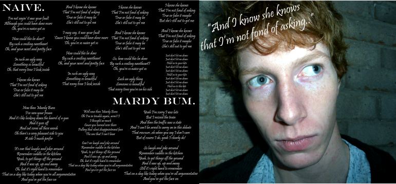
The lighting used in my ancillary texts was quite mixed due to the editing skills I used on each photograph. On some I increased the brightness but on others decreased it to meet the use of the ‘dark location’ convention. In other indie products the lighting is quite dark and neutral so I decided to take my photos in natural light so that I could alter the colours, brightness and contrast myself. The lighting on the photo on my magazine advert is quite bright which enhances the band’s personality and body language. This then highlights their importance in the indie genre so combines the use of both conventions. The lighting on my digipack is also quite bright so it ties the two products together. If the lighting was really dark the ancillary texts wouldn’t fit into the indie genre because the band would look too intense and serious. The lighting in the photos also works well the choice of colour scheme used for additional features such as font colour.
Mixture of Close Ups and Longs Shots
A convention that I used the most of throughout my ancillary texts and music video was the use of extreme close ups and long shots and these are used a lot in real media products. By using a mixture of these camera angles, it keeps the video interesting as faster shots encourage the audience to keep watching. I decided to use this convention on my ancillary texts as well to tie the three in together. By using a variety of different camera angles whilst taking photographs make the products more eye catching and appealing. The photographs also look more professional by using a wide range of camera angles because they can be seen in other well known media products to enhance the band’s style and personality. High angle, low angle, mid shots, close ups, extreme close ups and long shots were all considered and used whilst we were taking photos and filming. This way we could plan which photos we could use on each panel to vary the types of camera angles, which created an effective contrast. The use of extreme close ups and long shots really portrays their positive and enthusiastic attitude as a band which also helps express the indie genre as they highlight their dancing, singing and body language.
Band Performance
In my ancillary texts I decided to just use photographs of the band as I wanted the photos to be relevant to the band themselves. I did not want to overuse my editing skills with pictures I drew even though this is a common indie convention used on real media products so I thought by using a minimal amount of edited images would enhance this effect. The band can be seen on each one of the panels on my digipack but portrayed in a different way. The composition was also varied and mixed up to create an effective contrast meaning that different band members could be seen together. It is common to see a band perform throughout an indie music video as they feel that it is important that the audience focuses just on the band themselves. Because of this I used similar photos on the magazine advert and on the digipack so that locations and style was the same. This way they can be recognised by these two elements whether they are performing or not.
Editing
Editing is major convention used in all indie media products. I used editing for both my ancillary texts and the music video. For my digipack I edited images that I drew myself as animation is another common convention used on these types of products. I edited these images by adding filters, altering colours, brightness and contrasts. I also edited the photos that I took to increase the quality and make them look more professional. I used this same technique to edit the photograph on my magazine advert. I altered the colour tones and contrast so that the photo looked more vintage to show that it fits into the indie category. Without the use of this convention, my ancillary texts would not look as professional as other media products.
Mise en Scene
Mise en scene was important to consider when constructing the ancillary texts. I used the same locations to take photographs for both products to show consistency. I think the choice of location was suitable and for type of genre as it is very simple and basic. The lighting was natural so artificial lighting does not distract you from the band and limited props were also used. On some photos on the digipack there was a use of the drums so this enhances their interest in music and enthusiasm as a band. I felt it was important to keep the mise en scene very simple as indie bands usually focus on just the music and no hype about set or performance style. Therefore the simpler this convention was, the more the audience could focus on the band performance and style.
Overall I feel that the use of these common indie conventions make my ancillary texts and music video a success because without these they would not look as realistic and they would struggle to fit into today's music industry as they would not fit into the indie category. Some conventions were hard to develop or challenge as the indie genre is so simple and basic and this was the aim of our band. By researching these conventions in advance enabled me to decide which ones would work well for our indie band and which ones would be too complex for us to use. I could also find out more about how they are used and why so I understood how they are meant to be portrayed.