
Monday 31 October 2011
DigiPak Inspiration

As I was struggling for inspiration to go into the inside panels of my digipak I looked at Bombay Bicycle Club's inside to see what they had done. They used an image and the displayed information concerning the album. This is something I think would work well with my digipak and I will be experimenting with this idea.
Digipak Feedback
The Digipak:
I knew I would have to make a lot of imporvements on my digipak when I originally handed it in, so the feedback was necessary to help give me some ideas as to what I could do in replacement of the inside panels. I will be looking into featuring images of the band on the inside or possibly using lyrics from the album as the current panels do not work at all. This will be my main focus during the changes. /i will also be making a few changes to the smaller details such as the barcode and adding in record label details and further information.
Magazine Advert:
The feedback for this was much more positive and I will be continuing with the simple advert as it is. The only details I will be changing is making the text below the image smaller as well as filling in all the extra details and just refining the details
Friday 28 October 2011
Thursday 27 October 2011


Progress made from filming to editing.
This week I have spent time each day experimenting with the different types of editing software. After we filmed and labelled all of our clips in order, the first software we tried to use was Abobe Premiere Elements. There has been a lot of problems with this particular software with the computers at school. We tried importing all of our clips but the software wouldn't allow them to be added. The reason for this was unclear although we were told that it was possibly because the format of the files were not compatible. To solve this problem we converted the original clips into two other formats, WMV and MPEG files. This way we thought that at least one file type would work. After this, we then tried importing the clips again into Premiere but we once again came across the same problem so we gathered it was the software itself that was the issue. As this software wasn't working for us we got in touch with the ICT technicians to see if they could solve the problem. They tried hard to fix it over a number of days but whilst it was working for others, we were still having issues with starting to edit our video due to the lack of software. Whilst the technicians were trying to fix Premiere, I decided to use Windows Movie Maker for the time being so that I could at least try and do some form of editing as we were running short on time. This software would only allow me to import the WMV files so I managed to edit nearly a whole minute of the entire video. Once I started editing I got really excited that the video was coming together as a whole as the clips made much more sense and looked exactly the same as the storyboard. The lip syncing looked very effective as timings were very accurate and the variety of clips looked very successful. I then saved the video on Becca's memory stick so that she could view it at home as she too has Movie Maker. I was disappointed to hear that she couldn't view the video due to further problems with Movie Maker and the format of the clips once again. The software said that the files were not in the correct format. This was quite frustrating as it was yet another attempt that got quite far into the editing this time but the software once again let us down. This then meant that neither pieces of editing software was working for us. Tomorrow is the deadline for our draft music video and it was only this morning that we managed to actually start using Adobe Premiere. We had multiple attempts as we were affected by other factors such as slow software, low disk space and bad quality clips although we did manage to put together a short amount of the video. We had to use the WMV files which do not look a great quality in the video but at least we know have an idea what the clips look like together and how well they link. The timings are not perfect as we were short on time and this is something that we will make sure are completely correct if we are able to complete the full video with the better quality MOD files next week. I am eager to start editing the whole video again once the software is completely up and running as I have found that I now have enough experience and the skills to use Adobe Premiere due to testing each type of software this week. The time wasted trying to fix the problem is quite disappointing as we were both looking forward to put the video together although we hope to have constructed a draft of the whole video by some time next week!


Higher Quality
As the format we were using before was terrible quality we have worked with It to make it possible for us to use clips of higher quality. Hopefully this is the standard of the clip we will be using for future drafts and the final product.
Progress so far..
This is the video we have managed to create for now, the quality and timing is not what we intended at all and needs a lot of work, however it is an idea of what we will be doing.
Technological Difficulties
We have again encountered some difficulties with the software. Everybody, from our teachers to the IT technicians has supported us in trying to overcome this, but with little success, unfortunately. We were unlucky enough to lose all of our footage, but, thankfully we were able to restore with the help of IT, although the process was very time consuming. We will still upload work for the deadline, and will be working hard to ensure this.


Wednesday 26 October 2011
Further Difficulties in Editing
Having had to compromise with the software used, we are still having difficulties with editing our films. The movie maker program at school is inconsistent with those on our own laptops which leaves us unable to edit easily and only to a very low standard. Adobe premiere is still unavailable at school and after downloading a trial version on a home computer, we found that a water mark was left due to having not fully purchased the software. This leaves us in great difficulty in being able to complete all, if any editing before Friday. It is unfortunate that we have not been able to purchase computers advanced enough to be compatible with such editing software, as the benefits of having this available at home would be good, however financially it is not possible. We will in future be less reliant on any school technology, we have no way of editing any clips at school on a program requested by our teachers, nor do we have we had the help to overcome these problems. We are currently speaking to the IT department and are working with them to get it fixed. However, with such a lack of software available to us, we are struggling.
Tuesday 25 October 2011
Difficulties in editing
Due to lack of equipment available to us at school we have come into many difficulties already with the editing of our raw shots. The computers we are using do not have the sufficient software we have been told we need for editing so the process could be much more difficult and time consuming than originally planned. This is a difficulty we will be trying to overcome as best as possible however due to these circumstances and the lack of control we have with the computer software at school we will struggle to complete as successful a product for our first draft than we originally intended.
Monday 24 October 2011
Record Label
LP Records are a London-based independent record label launched in 1992. Since it's launch it has become widely successful as an established record label in Britain, Europe and America. It was formed as a separate division from the music magazine 'LP' and was launched to coincide with the rise of Britpop throughout the nineties, signing on various bands of this genre and gaining a reputation of launching these artists on a more global level. Within the last decade the company has moved into signing more indie-alternative and indie-rock artists and have again achieved much success, both in Britain and overseas. In the last five years the label has collectively achieved 17 number one singles and 8 number one albums in Britain alone. As an independent label they have proved very successful, forging links with Columbia and Sony Music to launch their bands more successfully. However, the companies new initiative in 2008 became to focus on bringing to light smaller bands and introducing them to a more specific and niche audience as oppose to a more global market. This involved creating various smaller venues in which these artists could play and allowing smaller scale releases to a more targeted audience.


Update.
On Friday we filmed all of our band performance shots and took a variety of photos of the band. We are going to film the front door shots on Wednesday evening as we could not film these on Friday due to not organising the outfits that were needed for one particular actress. This is a major error that we have learnt from as next time we need to check over each shot that we plan to film on the day in advance and double check what outfits the actors and actresses need to bring. From tomorrow until the end of the week we will begin to edit all of the clips we have filmed to date and once we have Wednesday's final shots we should be able to add these ones to produce the draft version of our video. The deadline will be tough to meet as time is very limited and skills with editing are not of great quality but me and Becca will be spending any free time together and possibly staying after school to complete the draft video. From our draft video we will identify any errors or improvements that we can make to ensure that the final video as successful as possible. We will particularly focus on mise en scene, lip syncing, lighting, costume and location. Hopefully our skills with editing will be learnt through constructing the draft version and that they will be much better by the time we finish the final version.
Friday 21 October 2011
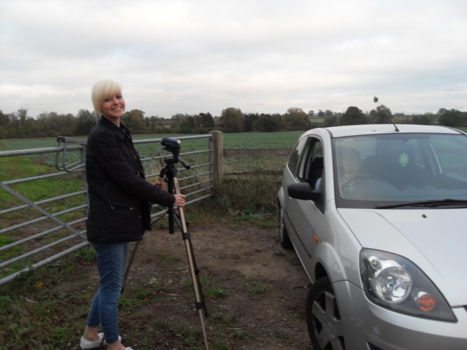
Band Photoshoot.
During filming on Friday we decided to take multiple photos whilst the band were performing and also individual photos which can all be used for either the digipack or magazine advert. These worked well as they look quite realistic even in the unusual setting. These photos may be edited depending on the style and colour scheme used for the ancillary texts. I may experiment with editing the photos just like I did with the previous drawing I produced to see which techniques and filters work better than others. I think the outfits that the band wore made the band look successful as a whole and made them look like they fit into the indie/alternative genre.
Thursday 20 October 2011
Filming - Styling
These are the clothes in which we dressed our actors. We wanted a youthful realistic look to create the right effect of the video and this is what was decided. For Sara we dressed her in casual but pretty shorts and a neutral top. We thought tights would make the look more relevant to the time of year. James is again dressed in casual jeans and a check shirt which is typical of the genre we are focusing on.


Tuesday 18 October 2011
Plan for Friday.
On Friday we will be filming the final story shots of the video, the band performance shots and doing a photo shoot. Before then, we must ensure that everything that we need is sorted and plan in advance to make sure everything runs smoothly. Me and Becca have been keeping a close eye on the weather forecast as our band performance will be taking place outside. We have also constructed an order to which our shots will be filmed so that we can do a chunk of shots with the same actors/actresses and whether they are in the same location or not. The photo shoot will be taking place whilst the band are performing and some will also be taken in a different location for some individual photos. Costumes and props have been organised so these just need to be brought or collected. We will be constantly referring to our shot list and schedule throughout filming on Friday to ensure we do not miss any shots out and that we have everything we need. We also need to make sure we have the correct equipment and this just includes the tripod, video camera, digital camera, PA kit and instruments.
Ideas for a Record Label.
Along with my digipack, I will also need to create my own record label. Here I have created a few possible record label names from selecting random words but words which are still quite relevant to music. From researching multiple record labels on the internet, I have found that they can be called anything but some are more complex than others. I think that the record labels that look and sound more effective are those which have either one or two words. Here is the short list of record label names I have created and these have been narrowed down from a longer list. These all sound quite realistic and could fit into the current music industry. The record label I have decided to choose for my band is Studio 10. I like the simplicity of this name and how it doesn't specifically target one genre of music. The two words have no relevant link to our band but still have a link to music. I want to keep the logo as simple as possible so I have put the name of the record label in a simple oval shape filled with black and white, surrounded by a dark red border to create a slight contrast. This design may change but this is my idea at this stage.
- Transmission Records
- Capital Records
- Freedom Recordings
- Studio 10
- Situation Sound
- Monotone
- Sunset Recordings
- Bassline
Chosen Record Label: Studio 10
Logo:

Sunday 16 October 2011
Filming Update
The majority of the filming for the story element of our video has been completed. Throughout half term we will be filming the band performance and some final story shots. We have filmed everything we required along with additional shots; this is due to us knowing that perhaps with our limited skills in filming, certain shots we had planned may not be right or work well. Despite this I believe we have developed our skills using camera equipment and creating and producing the shots we needed.
Friday 14 October 2011

Thursday 13 October 2011
Magazine Advert - Mock Up

This is the mock up of my magazine advert; it is strongly influenced by the album cover as this seems to be a theme throughout most adverts I have looked at. The information is again typical of the adverts I analysed, and the I have kept my approach simple to reflect both the band and the genre.
Wednesday 12 October 2011
Filming Begins..


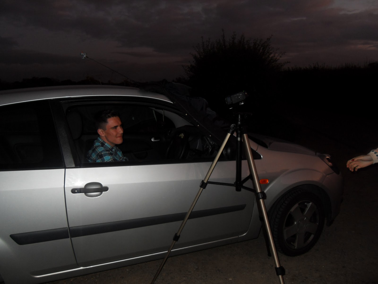

For the last two days we have began filming some of our shots from our storyboard. We came up with a schedule and planned out the order of each shot so that shooting ran smoothly. This helped us organise what shot came where and saved us a lot of time. Throughout these two days we have been filming the kitchen and the car shots. This generally went quite well but organisation could have improved by informing the actors/actresses specifically what they had to do in advance so that we didn't have to spend time explaining to them. For each shot we have been shooting for longer than necessary so that we have enough footage to edit.This way we won't run out of shots in case we delete them and then find that we need them at a later date. After each shot we also watched it immediately after to ensure that mise en scene,lighting, props and lip syncing was working successfully. The picture above shows our actor James watching the shots back to also gain his feedback and opinions on how successful they are. Continuity was also a key element so we had to ensure our characters were wearing the same outfits and props were in the same location.
Tuesday 11 October 2011
Mock Magazine Advert.

Here is the mock magazine advert that I have constructed. At this point the layout, fonts and image is very basic as photos have not yet been taken for he final ancillary products. The image relates to the image on the back of the digipack as I wanted the link between the same artists. He is doing the same pose in this photo so I will get our lead singer to so a similar thing but without a prop. I have included the basic information about the album release and additional information may be added on things such as tour dates. I am still unsure about the solid colour of the background and the text may need to be rearranged due to the change of image. But this will be similar to the final magazine advert.
Monday 10 October 2011
DigiPak Mock-up Ideas

This is my first mock up of the outside panels on my digipak. There are several things I will be editing and this is very much a rough idea, however it does give a clear representation on what I am planning to produce. Feedback and further editing will provide me with a lot to work on. I also need to add in record company details and other information.


I have designed two mock ups for the inside of my digipak to experiment with different techniques. They are of course similar to coordinate and match the front of the digipak however I have tried different colours and techniques. At present my preferred mock up is the second one, I feel it varies more to the outside panels and creates a bit to present on the digipak as oppose to a repeating the pattern from the front. I will of course wait for feedback and then consider where to go on from there.
I will also be including a booklet in my digipak that will be placed in the far left sleeve of the pak, It will include song lyrics as well as photos and swords from the band. It will also feature some of the images from the cover to continue the theme.
Initial Ideas for Album Cover
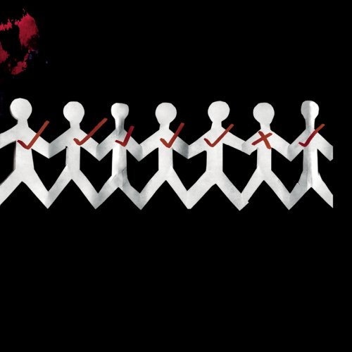
After considering a lot of different options for my cover I decide to stay simple but effective with my approach. I wanted a basic image that had relevance to the bands name but also allowed for a more abstract idea to form and develop. The actual idea of using the paper chain men came from the 3 Days Grace Album 'one-x' as they too use this idea. However they have a much darker feel to their cover and I wanted neutral colours as I thought this represented the genre of the band well. If I use this idea I plan to create the stick men myself and either photograph or scan them in and then put it all together on photoshop. I will be experimenting with different styles of cut out and the different effects create by a photograph or by scanning. I may also experiment with colours depending on feedback I receive. Again the writing is very basic as it seems to be throughout the genre the band is. I positioned it central more as I quite liked the idea of symmetry throughout the cover and I also didn't want too much spare white space as I think there is on the mock-up with the text in the corner. I think the white works well for the background however I will most likely experiment with other colours and shades. I also chose the name 'anatomy' for the album title as I thought it was short and of course linked to the idea of people.


Mock DigiPack.
Outside Panels


Spines
Here I have constructed a mock version of what I wish to achieve or something similar. The images that are included in the digipack will not be used as they are not my own photographs but during the time of filming we will produce a photo shoot and take many photos and I will pick which ones I think look most effective and best quality. I like the consistent colour scheme used here as it is very simple but the colours work well together. The fonts are also very simple and I may change these depending on the choice of images. I think the use of drawn images and animation are very eye catching and fit well into the indie genre as this is a common convention used. The cat theme represents the cat 'Pablo' and this needed to be consistent throughout the whole digipack so I used cat elements on most panels. The panoramic shot of the trees works quite well but I am still unsure whether it fits in with the theme at this stage but they do create an interesting contrast. The grey pocket located on the inside panels will hold the insert booklet. Many changes will be made to the final digipack and the pictures will be of a greater quality although this draft version indicates my ideas at this stage.

Magazine Advert Analysis

This is an advert for Noah and the Whale's tour however the advert itself still features similar qualities. The image used is the album cover of the band's latest album. It features the band posing, in a simple room but as the image moves down it merges into a street at night. It is only a section of the album cover used but it is clearly the most predominant and relevant section for this advert; the band are touring so need to be the main feature. The font of the Artist name is identical to the album artwork and stretches the exact length of the image which is central placed on the top half of the page. The bottom half, as seems to be common is for the detailed information about the tour. The dates are all structured and follow the font style of above. The use of the 'sold out' in bright red both draws the audience’s attention and also makes tickets seem more desirable if there are fewer available. It is also a practical element as of course tickets for these shows are no longer available. The colour scheme matches the album and contrasts well in black and white on the page. There is of course other colours featured in the image but on black and white these work well. The image also appears to have been edited to create a slightly diffused glow on the artists, or it could perhaps be the effect of merging two photographs together. The shot used is a mid shot from the front capturing the band equally from all their different levels. There is also a small advertisement for the new album at the bottom, this would encourage previous fans of the band to go out and further listen to the music in preparation for the live show. The writing is kept central to keep consistency throughout, however the album image has been placed in the right bottom hand corner; this could be to attract attention for anyone simply flicking through the magazine as it would be something that might catch their eye. I like that the image is small as it does not draw away from the advert itself. If I was to create an advert for tour dates this would be a good template of what I would hope to achieve.
Update on video

Magazine Advert Analysis
 This advert contrasts completely to The Smiths advert I looked at. This is much more current and relevant to today’s market. The almost messy presentation reflects the style of the band as well as the title of 'mind chaos' I think from looking at this it seems many adverts are based on the album that they are advertising as oppose to the band itself; the band should be recognisable in their style but it is the album they are clearly trying to sell. The image is simply the album artwork and it occupies the majority of the top half of the page. This is the most obvious way of reflecting the album as it is what represents it, I think as the image ties in well with the rest of the page it works effectively and is something I should consider using as it seems a theme that the album artwork is used in the magazine advert for this genre and possibly on a more wider scale. The same font is used consistently and is again brought through from the album artwork. It is the size of the fonts that actually vary, with the most important information being the largest and smaller details obviously smaller. The artist name is included in the image four times so clearly they did not believe including this a fifth time would be necessary allowing more space for further information. The inclusion of 'the debut album' at the top of the page would make the advert seem more appealing as again people want the new and latest bands so an new band with their first album would be something worth listening to, it encourages a neutral view from the audience as this is the first album they will have produced so do not have a reputation to fall back on as of yet. Including the singles however pulls in the audience by recognition. As a new band, the artist themselves may be less recognised than the songs so including the single names would attract an audience that recognises them. Highlighting the release date is also important (we can see this from the bigger size) because it is what they want the audience to remember, they want them to go out and buy it so this is essential information I will be sure to include. Also the use of website information seems to be used on many adverts so this is something else to consider.
 Saturday 8 October 2011
Drawn out mock version of DigiPack.
Outside Panels


Here I have drawn out my mock version of the digipack. This shows my ideas at this point although this may change suring the making of my actual digipack. Colour schemes, fonts and images are not final yet but I will experiment with photoshop to see what else looks effective. I have produced a few mock versions of each panel previously and I may choose to use one of these but I need to see which ones work better with others. This is because I would like the panels to all link in some way. The front cover will be the main basis of this so I will decide on this first then work through the remaining panels. I am interested in editing images to make them more unique and different to other albums out currently. This is also a convention in the indie genre so this will also link to the band and other artists. I will also need to produce a spine which will simply include the album name (Pablo and the People), the record label information and possibly the band website. I will also start deciding on and constructing a record label name and logo.
Analysis of Magazine Adverts - The Verve.

This magazine advert for the verve is very unusual. The image is very distinctive and almost creates a very dark, mysterious atmosphere. The lack of colour and different textures created makes the image quite disjunctive as there is no significant link to the single title. The image is very monotone and surreal as it looks like an abstract photo of the sky and a landscape. The contrast in black white and browns creates a very interesting tone as they work well together but emphasise the surreal elements of the photo. The darker border at the centre of the advert creates a main focusing point as the remainder of the background and photo just look like clouds. The layout is quite simple the the text is centralised as there are no separate images, just one that is used as a background. I like the simplicity of the colour scheme as it doesn't distract you from any other elements such as the text or the image itself. The type of shot used is a high angle, long shot. This is very effective as it makes you look at the image at a different perspective and makes you realise what it actually is even though it is quite abstract due to editing. Editing has been used very carefully to make this image look the way that it is. Alterations have been make to the colour and also the contrast has been increased so that it looks more dark and 'mysterious'. I will be using graphical elements in my own magazine advert as this is a common convention in the indie genre so these skills may be needed. I think the contrast between bright and dark in the image is what makes it so successful. The fonts that are used are very simple but still stand out. The band name and song title are centralised in the middle of the advert and this is purposely done as it is layered on top of a brighter area of the image so that the bold, black font can be seen. The font size is not too big but still big enough to see. This way you can focus on the image and the text and doesn't create one main focusing point. The song title is 'Love Is Noise' and you can see that there is no link to this and the advert itself. This is quite effective as it makes it more imaginative and leaves you to make your own decision of what it is trying to express. The more important information is located nearer the bottom of the magazine advert where the background is darker so a white font is used. The text is quite small and minimal but enough information is provided for the user to understand what it is that they are advertising. The information explains the download itself, exclusive information and their website. This is enough information to include because if there is too much text the viewer may get bored of reading it and will lose interest. Overall I think the design of this magazine advert is very appealing and interesting. I like how it has no clear link to the artist or single title which makes it so surreal. The textures that are created by the colour palette and editing skills makes it look more realistic and also makes a 3D aspect. The clear, bold font is also a success and the centralised alignment of the text also works well and creates more room for the viewer to focus on the image.
Analysis of Magazine Adverts - Foals.

I fine this Foals magazine advert very appealing and eye catching. The images are very unusual and the drawn designs are extremely detailed but have no significant relevance to the release of the new single which expresses the disjunctive aspect. The images relate to the font as the font also looks like it has been drawn so this ties the two elements together. I previously analysed on of Foals album covers which was also a drawn design which had the same font so this shows that it linked. This drawn aspect seems to be very consistent throughout the indie genre so this is something I may consider when designing my digipack or magazine advert. The layout is quite organised as the image spreads over from right to left. This makes the text easier to read and also makes you focus more on the image itself. Some images seem to be clearer than others. Hearts, Sun and other elements of weather seem to be clear in the image so this may be linked to either the song or the album. I like how the vibrant purple background complements the whites, pinks and blacks and blues. The title instantly stands out as it is located in the top left hand side of the advert so even if the image doesn't explain the advert, the viewer can instantly see that it is Foals. The font style can also express this as it is mostly used for their other albums and singles text. There are no particular types of shots used as there are no photographs on the advert but I think the layering of the drawn images is very successful due to editing. Graphical elements have been used to create this collage effect and I personally think that this works very well. The images have no clear meaning to them and they also look quite child-like but there may be a link to the artist expressing a certain feeling memory or emotion. I think the font style used is one of the main successes of this magazine advert as it looks like it has been drawn out to the link to the image. If it was any bolder or a different colour, it would distract you from the image and it wouldn't work as well. The band name and single title stats off with a very big font to catch your eye then the text gradually gets smaller to provide additional information. This information is very important and is another thing that I will have to consider when designing my own magazine advert. It needs to tell the target audience when it is to be released, inform them of any exclusive tracks or versions, provide a website so they can look for further details and specifically what it is they are advertising. This advert does this very clearly. The information is specific although they could provide extra, more exclusive information as text is very minimal. Overall the design is very effective. The images and text complement one another as they are of similar styles and the colour scheme makes the advert instantly stand out. Common indie conventions can be seen in this advert and I will adapt these when developing ideas on my own magazine advert.
Friday 7 October 2011
Analysis Of Magazine Adverts - Laura Marling.

This magazine advert is very simple and basic but very effective. The use of abstract design can be seen which is a common convention in her type of genre. The neutral colour scheme works very well and complement the plain background and text. The image itself is quite unusual but I like how the dark patterns highlight the lighter flower in the centre which creates a focusing point and an interesting contrast. There is no direct link to the image and the artist which makes it more appealing and imaginative. The drawing expresses the detail that has been inputted to the image and helps emphasise the human shaped figure in the centre which shows it is appropriate to the album. The images are of natural forms as you can see leaves and tree like figures which makes it very unusual yet effective. This also merges into the human figure which adds a different aspect to the image and shows that it is quite disjunctive. The layout is also very simple as the image and text is centralised. This makes the advert more aesthetically pleasing and easier to read and look at. The colours work well together which also makes it a success. I like how the use of one single bright colour highlights particular elements of the image. There is no specific type of shot used as it is a drawing although the image does cover the majority of the the page which makes you focus on the image more closely. A lot of graphical elements have been used to create this magazine advert. Editing has benn used on the text to align the context and also the image would need to be edited so that it looks successful as a whole. I like how the font style works well with the image itself as it is quite feminine and the larger size makes it stand out immediately to the viewer. The overall effectiveness of this design is very eye catching and unique. I like how complex the image is and how well the text links to the genre of the artist and provides important and relevant information.
Magazine Advert Analysis

This is the promotional poster for The Smiths This Charming Man record. Although it is not designed for a magazine it still features the conventions of a poster and gives the same details which would be included in a magazine advert. The first thing to look at is that it matches to the cover of the record. The image is that off of the vinyl cover, and the colour scheme and font is identical. Having consistent artwork and style for the release is definitely effective and something I will be using as it ties all the advertisement together; if people were to see this advert when flicking through a magazine then they would also recognise the record cover; this is what I will be aiming to achieve. The use of two colours is typical of The Smiths so again this colour scheme represents the artist well. It is important that the colour scheme reflects the music and style tastes of the audience. The image itself is most likely aimed at the album title of 'This Charming Man' in an ironic sense. I like the use of reflection in the water as it adds another element to the image, as opposed to just a man lying in water. The style of the man reflects the age of the photo. His style is that of the early 80's in which the record was released. The use of the camera looking down on the man reflects the image of the man being inferior as of course he is lying supposedly passed out in a on the ground with his face in a puddle. The image is the predominant feature of the poster, taking up three quarters of the page. However the other quarter includes lots of information. The artists name is written in the font always used to represent The Smiths so acts as a logo for them. The font is bold, easy to read and very simplistic. The colour matches that of the image and stands out well against the background, so would be easy to read from a distance of sorts. This is something to consider as looking a magazine, the audience could just be flicking through and that would catch their eye. The largest font on the page is the title of the record, this is what will stick in the audiences mind and so will make them more likely to listen to the song and then buy the record. Using the words 'The new release' or 'The new single' appears to be common on adverts. Using the word 'new' adds appeal as the audience are always looking for the latest thing, so advertising it a new would appeal to people who aren't necessarily fans of the band itself. Other details are in a smaller font, as of course they are less important. This is information that is read after the audiences' attention has already been grabbed. Below this is then the logo of the record label the band is signed to. This also appears to be something that is necessary to include on the magazine poster. All writing is central to the box in which it is contained and is fairly spread out, with more space left for the larger writing and smaller text bunched closer together. This achieves the effect of the writing not looking too crowded yet also not overly spread out so that there is just blank space.
Further Research on CD covers - The Beatles - Revolver - Klaus Voorman.
The Beatles - Revolver

For my CD cover I am currently experimenting with drawing sketches and editing images. This is a perfect example of an abstract cover by Klaus Voorman. His art is very similar in the sense that his drawing style is very consistent and uses the same colour palettes; in this case black and white. This looks very effective as it highlights the detail of the drawing but by including images it emphasises the collage aspect. I like how the artists are laid out equally surrounding the cover and the images and photos gradually get smaller nearer the centre which ties both elements in. The significant detail and combination of the drawings and photos symbolise their music genre and style. The different shots and levels of each artist creates a very interesting contrast and it makes you focus on more than one area of the cover. The emotions on the faces of each artist are very different but the photos are quite uplifting which adds humour and expresses the personality of the band. The layout is quite complex due to the mix of drawings and photographs but this works well as the images start out simple and larger nearer the border of the cover and the images get smaller which adds further detail so that you can view the cover as a whole. The detail of the drawings is a key element as to what makes this cover a success as they are of a great quality. I like how Voorman has combined and layered photos on top of the drawings to link the two together.I personally think that the colour scheme is what ,makes this cover so eye catching as it is very simple although expresses the detail that has been put into the drawings and thought of positioning for the images. If colour was included I feel that this would be too complex and would make you focus on just one area which wouldn't make the cover successful as a whole. Editing has clearly been carefully used particularly on the different layers of images. This must have been quite time consuming to get the layout completely satisfiable although the end product is very pleasing. The bold, black text located in the centre of the cover stands out immediately because of the simplicity and contrast to the white background. Overall I think this Beatles CD cover is very effective and works well with their particular music genre. The combination of drawings and photographs is something I may wish to use on my CD cover as it adds a different element and makes the cover more unique.


Thursday 6 October 2011
Further ideas on DigiPack - Practice Mock Ups.
Front Covers
My main aim is to have a silhouette figure of two of the band members in the cat's eyes. I do prefer the image as it was previously although once photos have been taken, I can then experiment with putting the figures in the eyes. They temporary images in the eyes were taken from the internet to demonstrate what I am aiming to do. I am also unsure of the colours of the eyes and text at this point as this will also have to relate to the inside panels of the digipack.


My main aim is to have a silhouette figure of two of the band members in the cat's eyes. I do prefer the image as it was previously although once photos have been taken, I can then experiment with putting the figures in the eyes. They temporary images in the eyes were taken from the internet to demonstrate what I am aiming to do. I am also unsure of the colours of the eyes and text at this point as this will also have to relate to the inside panels of the digipack.


First Panel
For the first panel that you will see, I thought it might look effective if there is another image of a cat but only select one area of the image from a previously edited image. Depending on which cover I choose, I will select a different edited image for this panel. As this is the first main image that you will see I have decided to use one of the cat's eyes and crop out the drawn part that was there before. I have then briefly drawn a pupil back into the eye and the white part will be filled with a photo of the band. This image may be black and white although I have not came to a final decision at this point.


Inside Panels
For the inside panels I thought it may look effective if I use the panoramic technique of photos of trees that I have taken. This will keep the digipack very simple so that it still fits into the indie genre. I have not came to a final decision about these images yet as I may also choose to use images of the band instead if I don't use them in the booklet that I will also be producing.


Track List
For the back panel I am not entirely sure on what colour scheme to use at this point as I have not decided on a final front cover yet. Once this has been chosen I can then decide what colours to use on each panel which will then be consistent. I have came up with a song list from various different artists from the indie genre which our band would find suitable to perform. The image I have used here will not be the image on the final design as it will be a better quality image of the lead singer James. This image is only temporary as we have not yet done our photo shoot so this is used to demonstrate where the image will be located. I will also need to construct a record label name and logo to position near the barcode to make the album look more realistic. The font may also change but at this point I am just developing ideas on layout and what elements to include.

(more to come)
Subscribe to:
Posts (Atom)