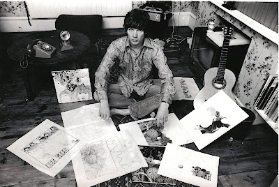
The Beatles - Revolver
For my CD cover I am currently experimenting with drawing sketches and editing images. This is a perfect example of an abstract cover by Klaus Voorman. His art is very similar in the sense that his drawing style is very consistent and uses the same colour palettes; in this case black and white. This looks very effective as it highlights the detail of the drawing but by including images it emphasises the collage aspect. I like how the artists are laid out equally surrounding the cover and the images and photos gradually get smaller nearer the centre which ties both elements in. The significant detail and combination of the drawings and photos symbolise their music genre and style. The different shots and levels of each artist creates a very interesting contrast and it makes you focus on more than one area of the cover. The emotions on the faces of each artist are very different but the photos are quite uplifting which adds humour and expresses the personality of the band. The layout is quite complex due to the mix of drawings and photographs but this works well as the images start out simple and larger nearer the border of the cover and the images get smaller which adds further detail so that you can view the cover as a whole. The detail of the drawings is a key element as to what makes this cover a success as they are of a great quality. I like how Voorman has combined and layered photos on top of the drawings to link the two together.I personally think that the colour scheme is what ,makes this cover so eye catching as it is very simple although expresses the detail that has been put into the drawings and thought of positioning for the images. If colour was included I feel that this would be too complex and would make you focus on just one area which wouldn't make the cover successful as a whole. Editing has clearly been carefully used particularly on the different layers of images. This must have been quite time consuming to get the layout completely satisfiable although the end product is very pleasing. The bold, black text located in the centre of the cover stands out immediately because of the simplicity and contrast to the white background. Overall I think this Beatles CD cover is very effective and works well with their particular music genre. The combination of drawings and photographs is something I may wish to use on my CD cover as it adds a different element and makes the cover more unique.


No comments:
Post a Comment