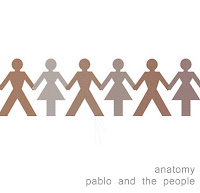
After considering a lot of different options for my cover I decide to stay simple but effective with my approach. I wanted a basic image that had relevance to the bands name but also allowed for a more abstract idea to form and develop. The actual idea of using the paper chain men came from the 3 Days Grace Album 'one-x' as they too use this idea. However they have a much darker feel to their cover and I wanted neutral colours as I thought this represented the genre of the band well. If I use this idea I plan to create the stick men myself and either photograph or scan them in and then put it all together on photoshop. I will be experimenting with different styles of cut out and the different effects create by a photograph or by scanning. I may also experiment with colours depending on feedback I receive. Again the writing is very basic as it seems to be throughout the genre the band is. I positioned it central more as I quite liked the idea of symmetry throughout the cover and I also didn't want too much spare white space as I think there is on the mock-up with the text in the corner. I think the white works well for the background however I will most likely experiment with other colours and shades. I also chose the name 'anatomy' for the album title as I thought it was short and of course linked to the idea of people.
Showing posts with label CD covers. Show all posts
Showing posts with label CD covers. Show all posts
Monday, 10 October 2011
Wednesday, 5 October 2011
Album Mind Map
For this I looked into the different aspects used in album covers for our genre. I split the research into categories so to gain an idea of what is required for different types of covers. For example, artwork covers are typically more colourful and abstract than photographs, most likely as the artist can depict brighter colours or perhaps the effect is just better created. The text is always similar in that it is simple to read and very often the bands logo for the name and then a varied but matching text for the album cover. Composition varies completely, however there does seem to be a theme of text in the top third of a cover, possibly the most eye catching area and something to consider in my design. Equally though, there is text in all various places so it would not be unconventional elsewhere or in fact to have no text at all.
Tuesday, 4 October 2011
Saturday, 1 October 2011
Further research for CD covers.
For this section I have collected a series of images of current and older CD covers to generate ideas on what ours may look like. These CD covers fit into our indie genre and the consistent theme that can be seen in most is the use of animation and cartoons. They are quite simple which makes them so interesting and unique. They are significant to the artist as you can see a link although some are quite disjunctive and unusual. We would like our CD cover quite simple but still clear what the album will include and that it has a link to our song in the music video or the band themselves.
Monday, 5 September 2011
Examples of Other Texts
CD Covers:
Looking at these covers it is clear the genre we have picked uses various different styles. A typical convention of any album cover is to have the artist's name and a photo of the artist(s) on the cover, as well as the name of the album. Looking at these covers it seems that the album and artist name nearly always feature, possibly more for practical reasons than anything else as it allows the audience to know what they're buying. However, it is not as typical to have the artist on the cover, particularly it seems with bands made up of men. Instead their covers often feature women or a piece of artwork accompanied by the artist and album name. The female artists more typically feature themselves. I think it is interesting that both genders seem to feature females on the cover, this is possibly something to consider for ours as it clearly appeals to the audience. The male artist covers are more simple so are probably aimed slightly more at males, or represent the the fact that the artist is male. The female artwork is more artistic and creative, which could again represent the artist but also be more aimed at females. However, I think all these album covers appeal to both genders overall. The typed words also reflect the band or the album in particular. They're either the bands logo or a very simple stand out font, which could represent the music itself.
Subscribe to:
Posts (Atom)


