Showing posts with label Further ideas on DigiPack. Show all posts

Monday, 10 October 2011

Mock DigiPack.

Outside Panels
                                                                Inside Panels
Spines
Here I have constructed a mock version of what I wish to achieve or something similar. The images that are included in the digipack will not be used as they are not my own photographs but during the time of filming we will produce a photo shoot and take many photos and I will pick which ones I think look most effective and best quality. I like the consistent colour scheme used here as it is very simple but the colours work well together. The fonts are also very simple and I may change these depending on the choice of images. I think the use of drawn images and animation are very eye catching and fit well into the indie genre as this is a common convention used. The cat theme represents the cat 'Pablo' and this needed to be consistent throughout the whole digipack so I used cat elements on most panels. The panoramic shot of the trees works quite well but I am still unsure whether it fits in with the theme at this stage but they do create an interesting contrast. The grey pocket located on the inside panels will hold the insert booklet. Many changes will be made to the final digipack and the pictures will be of a greater quality although this draft version indicates my ideas at this stage.

Saturday, 8 October 2011

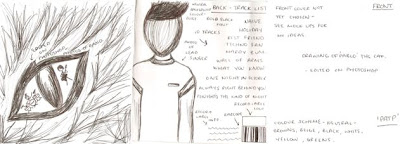
Drawn out mock version of DigiPack.

Outside Panels
                                                                     Inside Panels
Here I have drawn out my mock version of the digipack. This shows my ideas at this point although this may change suring the making of my actual digipack. Colour schemes, fonts and images are not final yet but I will experiment with photoshop to see what else looks effective. I have produced a few mock versions of each panel previously and I may choose to use one of these but I need to see which ones work better with others. This is because I would like the panels to all link in some way. The front cover will be the main basis of this so I will decide on this first then work through the remaining panels. I am interested in editing images to make them more unique and different to other albums out currently. This is also a convention in the indie genre so this will also link to the band and other artists. I will also need to produce a spine which will simply include the album name (Pablo and the People), the record label information and possibly the band website. I will also start deciding on and constructing a record label name and logo.

Thursday, 6 October 2011

Further ideas on DigiPack - Practice Mock Ups.

Front Covers
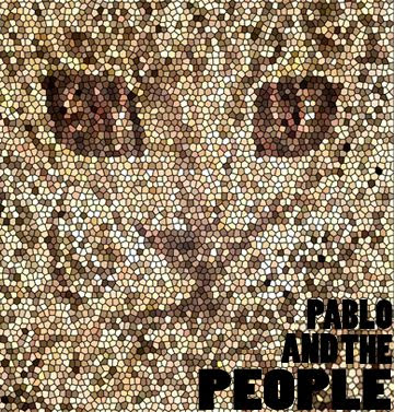
My main aim is to have a silhouette figure of two of the band members in the cat's eyes. I do prefer the image as it was previously although once photos have been taken, I can then experiment with putting the figures in the eyes. They temporary images in the eyes were taken from the internet to demonstrate what I am aiming to do. I am also unsure of the colours of the eyes and text at this point as this will also have to relate to the inside panels of the digipack.
First Panel
For the first panel that you will see, I thought it might look effective if there is another image of a cat but only select one area of the image from a previously edited image. Depending on which cover I choose, I will select a different edited image for this panel. As this is the first main image that you will see I have decided to use one of the cat's eyes and crop out the drawn part that was there before. I have then briefly drawn a pupil back into the eye and the white part will be filled with a photo of the band. This image may be black and white although I have not came to a final decision at this point.
Inside Panels
For the inside panels I thought it may look effective if I use the panoramic technique of photos of trees that I have taken. This will keep the digipack very simple so that it still fits into the indie genre. I have not came to a final decision about these images yet as I may also choose to use images of the band instead if I don't use them in the booklet that I will also be producing.  
Track List
For the back panel I am not entirely sure on what colour scheme to use at this point as I have not decided on a final front cover yet. Once this has been chosen I can then decide what colours to use on each panel which will then be consistent. I have came up with a song list from various different artists from the indie genre which our band would find suitable to perform. The image I have used here will not be the image on the final design as it will be a better quality image of the lead singer James. This image is only temporary as we have not yet done our photo shoot so this is used to demonstrate where the image will be located. I will also need to construct a record label name and logo to position near the barcode to make the album look more realistic. The font may also change but at this point I am just developing ideas on layout and what elements to include.
(more to come)