Showing posts with label research and planning. Show all posts

Monday, 10 October 2011

Mock DigiPack.

Outside Panels
                                                                Inside Panels
Spines
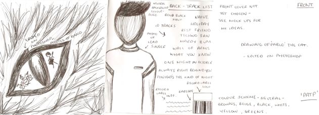
Here I have constructed a mock version of what I wish to achieve or something similar. The images that are included in the digipack will not be used as they are not my own photographs but during the time of filming we will produce a photo shoot and take many photos and I will pick which ones I think look most effective and best quality. I like the consistent colour scheme used here as it is very simple but the colours work well together. The fonts are also very simple and I may change these depending on the choice of images. I think the use of drawn images and animation are very eye catching and fit well into the indie genre as this is a common convention used. The cat theme represents the cat 'Pablo' and this needed to be consistent throughout the whole digipack so I used cat elements on most panels. The panoramic shot of the trees works quite well but I am still unsure whether it fits in with the theme at this stage but they do create an interesting contrast. The grey pocket located on the inside panels will hold the insert booklet. Many changes will be made to the final digipack and the pictures will be of a greater quality although this draft version indicates my ideas at this stage.

Magazine Advert Analysis

This is an advert for Noah and the Whale's tour however the advert itself still features similar qualities. The image used is the album cover of the band's latest album. It features the band posing, in a simple room but as the image moves down it merges into a street at night. It is only a section of the album cover used but it is clearly the most predominant and relevant section for this advert; the band are touring so need to be the main feature. The font of the Artist name is identical to the album artwork and stretches the exact length of the image which is central placed on the top half of the page. The bottom half, as seems to be common is for the detailed information about the tour. The dates are all structured and follow the font style of above. The use of the 'sold out' in bright red both draws the audience’s attention and also makes tickets seem more desirable if there are fewer available. It is also a practical element as of course tickets for these shows are no longer available. The colour scheme matches the album and contrasts well in black and white on the page. There is of course other colours featured in the image but on black and white these work well. The image also appears to have been edited to create a slightly diffused glow on the artists, or it could perhaps be the effect of merging two photographs together. The shot used is a mid shot from the front capturing the band equally from all their different levels. There is also a small advertisement for the new album at the bottom, this would encourage previous fans of the band to go out and further listen to the music in preparation for the live show. The writing is kept central to keep consistency throughout, however the album image has been placed in the right bottom hand corner; this could be to attract attention for anyone simply flicking through the magazine as it would be something that might catch their eye. I like that the image is small as it does not draw away from the advert itself. If I was to create an advert for tour dates this would be a good template of what I would hope to achieve.

Magazine Advert Analysis

 This advert contrasts completely to The Smiths advert I looked at. This is much more current and relevant to today’s market. The almost messy presentation reflects the style of the band as well as the title of 'mind chaos' I think from looking at this it seems many adverts are based on the album that they are advertising as oppose to the band itself; the band should be recognisable in their style but it is the album they are clearly trying to sell. The image is simply the album artwork and it occupies the majority of the top half of the page. This is the most obvious way of reflecting the album as it is what represents it, I think as the image ties in well with the rest of the page it works effectively and is something I should consider using as it seems a theme that the album artwork is used in the magazine advert for this genre and possibly on a more wider scale. The same font is used consistently and is again brought through from the album artwork. It is the size of the fonts that actually vary, with the most important information being the largest and smaller details obviously smaller. The artist name is included in the image four times so clearly they did not believe including this a fifth time would be necessary allowing more space for further information. The inclusion of 'the debut album' at the top of the page would make the advert seem more appealing as again people want the new and latest bands so an new band with their first album would be something worth listening to, it encourages a neutral view from the audience as this is the first album they will have produced so do not have a reputation to fall back on as of yet. Including the singles however pulls in the audience by recognition. As a new band, the artist themselves may be less recognised than the songs so including the single names would attract an audience that recognises them. Highlighting the release date is also important (we can see this from the bigger size) because it is what they want the audience to remember, they want them to go out and buy it so this is essential information I will be sure to include. Also the use of website information seems to be used on many adverts so this is something else to consider.
The background reflects the style of the poster and of the band as a whole. The paint splats are simple and sparingly used which i think is effective as well as using just one colour, as with the image on top it could be a bit too much. It reflects the album title and the style of the album covers exactly which is something that ties the whole advert together as a whole creating an overall very effective advert.

Saturday, 8 October 2011

Drawn out mock version of DigiPack.

Outside Panels
                                                                     Inside Panels
Here I have drawn out my mock version of the digipack. This shows my ideas at this point although this may change suring the making of my actual digipack. Colour schemes, fonts and images are not final yet but I will experiment with photoshop to see what else looks effective. I have produced a few mock versions of each panel previously and I may choose to use one of these but I need to see which ones work better with others. This is because I would like the panels to all link in some way. The front cover will be the main basis of this so I will decide on this first then work through the remaining panels. I am interested in editing images to make them more unique and different to other albums out currently. This is also a convention in the indie genre so this will also link to the band and other artists. I will also need to produce a spine which will simply include the album name (Pablo and the People), the record label information and possibly the band website. I will also start deciding on and constructing a record label name and logo.

Analysis of Magazine Adverts - The Verve.

This magazine advert for the verve is very unusual. The image is very distinctive and almost creates a very dark, mysterious atmosphere. The lack of colour and different textures created makes the image quite disjunctive as there is no significant link to the single title. The image is very monotone and surreal as it looks like an abstract photo of the sky and a landscape. The contrast in black white and browns creates a very interesting tone as they work well together but emphasise the surreal elements of the photo. The darker border at the centre of the advert creates a main focusing point as the remainder of the background and photo just look like clouds. The layout is quite simple the the text is centralised as there are no separate images, just one that is used as a background. I like the simplicity of the colour scheme as it doesn't distract you from any other elements such as the text or the image itself. The type of shot used is a high angle, long shot. This is very effective as it makes you look at the image at a different perspective and makes you realise what it actually is even though it is quite abstract due to editing. Editing has been used very carefully to make this image look the way that it is. Alterations have been make to the colour and also the contrast has been increased so that it looks more dark and 'mysterious'. I will be using graphical elements in my own magazine advert as this is a common convention in the indie genre so these skills may be needed. I think the contrast between bright and dark in the image is what makes it so successful. The fonts that are used are very simple but still stand out. The band name and song title are centralised in the middle of the advert and this is purposely done as it is layered on top of a brighter area of the image so that the bold, black font can be seen. The font size is not too big but still big enough to see. This way you can focus on the image and the text and doesn't create one main focusing point. The song title is 'Love Is Noise' and you can see that there is no link to this and the advert itself. This is quite effective as it makes it more imaginative and leaves you to make your own decision of what it is trying to express. The more important information is located nearer the bottom of the magazine advert where the background is darker so a white font is used. The text is quite small and minimal but enough information is provided for the user to understand what it is that they are advertising. The information explains the download itself, exclusive information and their website. This is enough information to include because if there is too much text the viewer may get bored of reading it and will lose interest. Overall I think the design of this magazine advert is very appealing and interesting. I like how it has no clear link to the artist or single title which makes it so surreal. The textures that are created by the colour palette and editing skills makes it look more realistic and also makes a 3D aspect. The clear, bold font is also a success and the centralised alignment of the text also works well and creates more room for the viewer to focus on the image.

Analysis of Magazine Adverts - Foals.

I fine this Foals magazine advert very appealing and eye catching. The images are very unusual and the drawn designs are extremely detailed but have no significant relevance to the release of the new single which expresses the disjunctive aspect. The images relate to the font as the font also looks like it has been drawn so this ties the two elements together. I previously analysed on of Foals album covers which was also a drawn design which had the same font so this shows that it linked.  This drawn aspect seems to be very consistent throughout the indie genre so this is something I may consider when designing my digipack or magazine advert. The layout is quite organised as the image spreads over from right to left. This makes the text easier to read and also makes you focus more on the image itself. Some images seem to be clearer than others. Hearts, Sun and other elements of weather seem to be clear in the image so this may be linked to either the song or the album. I like how the vibrant purple background complements the whites, pinks and blacks and blues. The title instantly stands out as it is located in the top left hand side of the advert so even if the image doesn't explain the advert, the viewer can instantly see that it is Foals. The font style can also express this as it is mostly used for their other albums and singles text. There are no particular types of shots used as there are no photographs on the advert but I think the layering of the drawn images is very successful due to editing. Graphical elements have been used to create this collage effect and I personally think that this works very well. The images have no clear meaning to them and they also look quite child-like but there may be a link to the artist expressing a certain feeling memory or emotion. I think the font style used is one of the main successes of this magazine advert as it looks like it has been drawn out to the link to the image. If it was any bolder or a different colour, it would distract you from the image and it wouldn't work as well. The band name and single title stats off with a very big font to catch your eye then the text gradually gets smaller to provide additional information. This information is very important and is another thing that I will have to consider when designing my own magazine advert. It needs to tell the target audience when it is to be released, inform them of any exclusive tracks or versions, provide a website so they can look for further details and specifically what it is they are advertising. This advert does this very clearly. The information is specific although they could provide extra,  more exclusive information as text is very minimal. Overall the design is very effective. The images and text complement one another as they are of similar styles and the colour scheme makes the advert instantly stand out. Common indie conventions can be seen in this advert and I will adapt these when developing ideas on my own magazine advert.

Friday, 7 October 2011

Analysis Of Magazine Adverts - Laura Marling.

This magazine advert is very simple and basic but very effective. The use of abstract design can be seen which is a common convention in her type of genre. The neutral colour scheme works very well and complement the plain background and text. The image itself is quite unusual but I like how the dark patterns highlight the lighter flower in the centre which creates a focusing point and an interesting contrast. There is no direct link to the image and the artist which makes it more appealing and imaginative. The drawing expresses the detail that has been inputted to the image and helps emphasise the human shaped figure in the centre which shows it is appropriate to the album. The images are of natural forms as you can see leaves and tree like figures which makes it very unusual yet effective. This also merges into the human figure which adds a different aspect to the image and shows that it is quite disjunctive. The layout is also very simple as the image and text is centralised. This makes the advert more aesthetically pleasing and easier to read and look at. The colours work well together which also makes it a success. I like how the use of one single bright colour highlights particular elements of the image. There is no specific type of shot used as it is a drawing although the image does cover the majority of the the page which makes you focus on the image more closely. A lot of graphical elements have been used to create this magazine advert. Editing has benn used on the text to align the context and also the image would need to be edited so that it looks successful as a whole. I like how the font style works well with the image itself as it is quite feminine and the larger size makes it stand out immediately to the viewer. The overall effectiveness of this design is very eye catching and unique. I like how complex the image is and how well the text links to the genre of the artist and provides important and relevant information.

Magazine Advert Analysis

This is the promotional poster for The Smiths This Charming Man record. Although it is not designed for a magazine it still features the conventions of a poster and gives the same details which would be included in a magazine advert. The first thing to look at is that it matches to the cover of the record. The image is that off of the vinyl cover, and the colour scheme and font is identical. Having consistent artwork and style for the release is definitely effective and something I will be using as it ties all the advertisement together; if people were to see this advert when flicking through a magazine then they would also recognise the record cover; this is what I will be aiming to achieve. The use of two colours is typical of The Smiths so again this colour scheme represents the artist well. It is important that the colour scheme reflects the music and style tastes of the audience. The image itself is most likely aimed at the album title of 'This Charming Man' in an ironic sense. I like the use of reflection in the water as it adds another element to the image, as opposed to just a man lying in water. The style of the man reflects the age of the photo. His style is that of the early 80's in which the record was released. The use of the camera looking down on the man reflects the image of the man being inferior as of course he is lying supposedly passed out in a on the ground with his face in a puddle. The image is the predominant feature of the poster, taking up three quarters of the page. However the other quarter includes lots of information. The artists name is written in the font always used to represent The Smiths so acts as a logo for them. The font is bold, easy to read and very simplistic. The colour matches that of the image and stands out well against the background, so would be easy to read from a distance of sorts. This is something to consider as looking a magazine, the audience could just be flicking through and that would catch their eye. The largest font on the page is the title of the record, this is what will stick in the audiences mind and so will make them more likely to listen to the song and then buy the record. Using the words 'The new release' or 'The new single' appears to be common on adverts. Using the word 'new' adds appeal as the audience are always looking for the latest thing, so advertising it a new would appeal to people who aren't necessarily fans of the band itself. Other details are in a smaller font, as of course they are less important. This is information that is read after the audiences' attention has already been grabbed. Below this is then the logo of the record label the band is signed to. This also appears to be something that is necessary to include on the magazine poster. All writing is central to the box in which it is contained and is fairly spread out, with more space left for the larger writing and smaller text bunched closer together. This achieves the effect of the writing not looking too crowded yet also not overly spread out so that there is just blank space.

Further Research on CD covers - The Beatles - Revolver - Klaus Voorman.

The Beatles - Revolver
For my CD cover I am currently experimenting with drawing sketches and editing images. This is a perfect example of an abstract cover by Klaus Voorman. His art is very similar in the sense that his drawing style is very consistent and uses the same colour palettes; in this case black and white. This looks very effective as it highlights the detail of the drawing but by including images it emphasises the collage aspect. I like how the artists are laid out equally surrounding the cover and the images and photos gradually get smaller nearer the centre which ties both elements in. The significant detail and combination of the drawings and photos symbolise their music genre and style. The different shots and levels of each artist creates a very interesting contrast and it makes you focus on more than one area of the cover. The emotions on the faces of each artist are very different but the photos are quite uplifting which adds humour and expresses the personality of the band. The layout is quite complex due to the mix of drawings and photographs but this works well as the images start out simple and larger nearer the border of the cover and the images get smaller which adds further detail so that you can view the cover as a whole. The detail of the drawings is a key element as to what makes this cover a success as they are of a great quality. I like how Voorman has combined and layered photos on top of the drawings to link the two together.I personally think that the colour scheme is what ,makes this cover so eye catching as it is very simple although expresses the detail that has been put into the drawings and thought of positioning for the images. If colour was included I feel that this would be too complex and would make you focus on just one area which wouldn't make the cover successful as a whole. Editing has clearly been carefully used particularly on the different layers of images. This must have been quite time consuming to get the layout completely satisfiable although the end product is very pleasing. The bold, black text located in the centre of the cover stands out immediately because of the simplicity and contrast to the white background. Overall I think this Beatles CD cover is very effective and works well with their particular music genre. The combination of drawings and photographs is something I may wish to use on my CD cover as it adds a different element and makes the cover more unique.

Thursday, 6 October 2011

Further ideas on DigiPack - Practice Mock Ups.

Front Covers
My main aim is to have a silhouette figure of two of the band members in the cat's eyes. I do prefer the image as it was previously although once photos have been taken, I can then experiment with putting the figures in the eyes. They temporary images in the eyes were taken from the internet to demonstrate what I am aiming to do. I am also unsure of the colours of the eyes and text at this point as this will also have to relate to the inside panels of the digipack.
First Panel
For the first panel that you will see, I thought it might look effective if there is another image of a cat but only select one area of the image from a previously edited image. Depending on which cover I choose, I will select a different edited image for this panel. As this is the first main image that you will see I have decided to use one of the cat's eyes and crop out the drawn part that was there before. I have then briefly drawn a pupil back into the eye and the white part will be filled with a photo of the band. This image may be black and white although I have not came to a final decision at this point.
Inside Panels
For the inside panels I thought it may look effective if I use the panoramic technique of photos of trees that I have taken. This will keep the digipack very simple so that it still fits into the indie genre. I have not came to a final decision about these images yet as I may also choose to use images of the band instead if I don't use them in the booklet that I will also be producing.  
Track List
For the back panel I am not entirely sure on what colour scheme to use at this point as I have not decided on a final front cover yet. Once this has been chosen I can then decide what colours to use on each panel which will then be consistent. I have came up with a song list from various different artists from the indie genre which our band would find suitable to perform. The image I have used here will not be the image on the final design as it will be a better quality image of the lead singer James. This image is only temporary as we have not yet done our photo shoot so this is used to demonstrate where the image will be located. I will also need to construct a record label name and logo to position near the barcode to make the album look more realistic. The font may also change but at this point I am just developing ideas on layout and what elements to include.
(more to come)

Wednesday, 5 October 2011

Album Mind Map

For this I looked into the different aspects used in album covers for  our genre. I split the research into categories so to gain an idea of what is required for different types of covers. For example, artwork covers are typically more colourful and abstract than photographs, most likely as the artist can depict brighter colours or perhaps the effect is just better created. The text is always similar in that it is simple to read and very often the bands logo for the name and then a varied but matching text for the album cover. Composition varies completely, however there does seem to be a theme of text in the top third of a cover, possibly the most eye catching area and something to consider in my design. Equally though, there is text in all various places so it would not be unconventional elsewhere or in fact to have no text at all.

DigiPack and Extras Research

I have looked into how bands in our genre market their album and what they offer to fans. Here I have looked at The Wombats store on their website. They sell an 'exclusive limited edition fan boxset' to fans which includes various things that I could consider including in my digipack or as an extra.
They include a vinyl of the album, which is not that unusual for the genre, however it is not something I would consider advertising or promoting as much. If I was to offer an alternative to a CD it would be the option of  a download as this is more accessible for our audience.
The T-shirt is an interesting idea to consider as many bands have these. Having an artist create a T-shirt for you as The Wombats have would also help to increase popularity and widen the audience as fans of the Artist would then be encouraged to listen to the band by association.
Offering alternative covers and extra photos or postcards as The Wombats have is something I would strongly consider including in the digipack as it encourages fans to buy it as oppose to download it because they want exclusive features. This is clearly a strong selling point so including these things would make the digipack more desirable.
Offering a bonus track is another selling point as fans would not want to miss out on a song by the band. This is something I would consider including as a special feature of the digipack.
Having anything signed would also make it more appealing and so this is also something to consider if I was to include any information such as this inside my digipack or on the magazine advert.

Looking at this I have gained some ideas into what to include in my digipack and how to make the it sound more appealing if I was to advertise it.

Ideas for sketch of front cover and editing on Photoshop.

Here I have scanned in my drawing that I may consider using for the front cover of my digipak and edited the image on Photoshop to see what I can achieve. The image may stay the same although I have decided that it might look effective if I take a picture of the lead singer and the guitarist from the band and paste them into the cat's eyes. I will then alter the contrasts and change these figures into silhouettes so that they look like the cat's pupils. This will give it a different effect as there will be a mix of drawing and photos. I have also decided that I will be chaning the location of the text and including the band logo somewhere on the cover. I won't be using the same font as the one that I have drawn and I may even decided to abbreviate the band name. Below are the edited images:


This edited image of the drawing looks quite effective and fits into the indie genre as cartoon and animation is a common convention of indie CD covers.

Vinyls from home.

Here I have taken a few photos of vinyls that are from home. This will help me generate more ideas on CD covers. The majority of these covers have the use of some sort of editing or animation. This is a consistent convention in our indie genre.