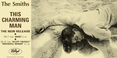
This is the promotional poster for The Smiths This Charming Man record. Although it is not designed for a magazine it still features the conventions of a poster and gives the same details which would be included in a magazine advert. The first thing to look at is that it matches to the cover of the record. The image is that off of the vinyl cover, and the colour scheme and font is identical. Having consistent artwork and style for the release is definitely effective and something I will be using as it ties all the advertisement together; if people were to see this advert when flicking through a magazine then they would also recognise the record cover; this is what I will be aiming to achieve. The use of two colours is typical of The Smiths so again this colour scheme represents the artist well. It is important that the colour scheme reflects the music and style tastes of the audience. The image itself is most likely aimed at the album title of 'This Charming Man' in an ironic sense. I like the use of reflection in the water as it adds another element to the image, as opposed to just a man lying in water. The style of the man reflects the age of the photo. His style is that of the early 80's in which the record was released. The use of the camera looking down on the man reflects the image of the man being inferior as of course he is lying supposedly passed out in a on the ground with his face in a puddle. The image is the predominant feature of the poster, taking up three quarters of the page. However the other quarter includes lots of information. The artists name is written in the font always used to represent The Smiths so acts as a logo for them. The font is bold, easy to read and very simplistic. The colour matches that of the image and stands out well against the background, so would be easy to read from a distance of sorts. This is something to consider as looking a magazine, the audience could just be flicking through and that would catch their eye. The largest font on the page is the title of the record, this is what will stick in the audiences mind and so will make them more likely to listen to the song and then buy the record. Using the words 'The new release' or 'The new single' appears to be common on adverts. Using the word 'new' adds appeal as the audience are always looking for the latest thing, so advertising it a new would appeal to people who aren't necessarily fans of the band itself. Other details are in a smaller font, as of course they are less important. This is information that is read after the audiences' attention has already been grabbed. Below this is then the logo of the record label the band is signed to. This also appears to be something that is necessary to include on the magazine poster. All writing is central to the box in which it is contained and is fairly spread out, with more space left for the larger writing and smaller text bunched closer together. This achieves the effect of the writing not looking too crowded yet also not overly spread out so that there is just blank space.


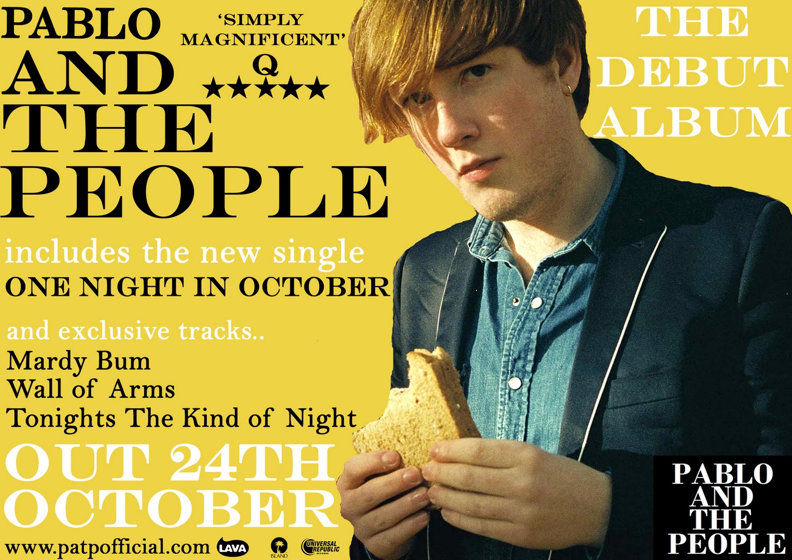

 This advert contrasts completely to The Smiths advert I looked at. This is much more current and relevant to today’s market. The almost messy presentation reflects the style of the band as well as the title of 'mind chaos' I think from looking at this it seems many adverts are based on the album that they are advertising as oppose to the band itself; the band should be recognisable in their style but it is the album they are clearly trying to sell. The image is simply the album artwork and it occupies the majority of the top half of the page. This is the most obvious way of reflecting the album as it is what represents it, I think as the image ties in well with the rest of the page it works effectively and is something I should consider using as it seems a theme that the album artwork is used in the magazine advert for this genre and possibly on a more wider scale. The same font is used consistently and is again brought through from the album artwork. It is the size of the fonts that actually vary, with the most important information being the largest and smaller details obviously smaller. The artist name is included in the image four times so clearly they did not believe including this a fifth time would be necessary allowing more space for further information. The inclusion of 'the debut album' at the top of the page would make the advert seem more appealing as again people want the new and latest bands so an new band with their first album would be something worth listening to, it encourages a neutral view from the audience as this is the first album they will have produced so do not have a reputation to fall back on as of yet. Including the singles however pulls in the audience by recognition. As a new band, the artist themselves may be less recognised than the songs so including the single names would attract an audience that recognises them. Highlighting the release date is also important (we can see this from the bigger size) because it is what they want the audience to remember, they want them to go out and buy it so this is essential information I will be sure to include. Also the use of website information seems to be used on many adverts so this is something else to consider.


 Again, another basic yet effective advert consisting of just the bands name, the albums release date and the albums cover. I think the choice to feature the bands album cover is an idea we should consider for our band seeing as they are not a well known and recognised band similarly to Mumford and sons (when this album was advertised). Featuring a album cover on an advert has the effect to eventually create a more recognised album. For example if a person was to be browsing online or in a shop for albums and they came across an album they'd already seen they may be more likely to take a second look as they are familiar with it. Further more I think it will allow the album to be easily identified.
 This advert is a bit more individual but just as eyecatching to the audience. The rebellious feel of the poster reflects the band's attitude and star image. However it follows the conventions of having the bands name the largest and the album title also very recognisable. Again the information is highlighted at the bottom below the main part of the image. The poster also include the bands website, which is something we should consider for when we make our own poster.
  This is again very colourful and draws attention to the image. The image is very modern and reflective of the artist. The wirting is also individual and stands out on the page. However with this the title is the main focus with the artwork identifying the artist. Although less recognisably, it is something to consider. The background image is also something wirth looking at. Again the details are clearly presented at the bottom of the page, this is clearly a convention of these posters. The details include a website, a quote about or from the artist and other relevant information such as the release dates and what is included in the product.