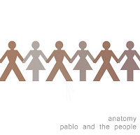
This is my completed mock up for my digipak.
Showing posts with label Mock ups. Show all posts
Showing posts with label Mock ups. Show all posts
Friday, 14 October 2011
Thursday, 13 October 2011
Magazine Advert - Mock Up
This is the mock up of my magazine advert; it is strongly influenced by the album cover as this seems to be a theme throughout most adverts I have looked at. The information is again typical of the adverts I analysed, and the I have kept my approach simple to reflect both the band and the genre.
Monday, 10 October 2011
DigiPak Mock-up Ideas
This is my first mock up of the outside panels on my digipak. There are several things I will be editing and this is very much a rough idea, however it does give a clear representation on what I am planning to produce. Feedback and further editing will provide me with a lot to work on. I also need to add in record company details and other information.
I have designed two mock ups for the inside of my digipak to experiment with different techniques. They are of course similar to coordinate and match the front of the digipak however I have tried different colours and techniques. At present my preferred mock up is the second one, I feel it varies more to the outside panels and creates a bit to present on the digipak as oppose to a repeating the pattern from the front. I will of course wait for feedback and then consider where to go on from there.
I will also be including a booklet in my digipak that will be placed in the far left sleeve of the pak, It will include song lyrics as well as photos and swords from the band. It will also feature some of the images from the cover to continue the theme.
Initial Ideas for Album Cover
After considering a lot of different options for my cover I decide to stay simple but effective with my approach. I wanted a basic image that had relevance to the bands name but also allowed for a more abstract idea to form and develop. The actual idea of using the paper chain men came from the 3 Days Grace Album 'one-x' as they too use this idea. However they have a much darker feel to their cover and I wanted neutral colours as I thought this represented the genre of the band well. If I use this idea I plan to create the stick men myself and either photograph or scan them in and then put it all together on photoshop. I will be experimenting with different styles of cut out and the different effects create by a photograph or by scanning. I may also experiment with colours depending on feedback I receive. Again the writing is very basic as it seems to be throughout the genre the band is. I positioned it central more as I quite liked the idea of symmetry throughout the cover and I also didn't want too much spare white space as I think there is on the mock-up with the text in the corner. I think the white works well for the background however I will most likely experiment with other colours and shades. I also chose the name 'anatomy' for the album title as I thought it was short and of course linked to the idea of people.
Subscribe to:
Posts (Atom)


