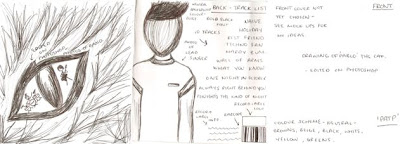
Here I have drawn out my mock version of the digipack. This shows my ideas at this point although this may change suring the making of my actual digipack. Colour schemes, fonts and images are not final yet but I will experiment with photoshop to see what else looks effective. I have produced a few mock versions of each panel previously and I may choose to use one of these but I need to see which ones work better with others. This is because I would like the panels to all link in some way. The front cover will be the main basis of this so I will decide on this first then work through the remaining panels. I am interested in editing images to make them more unique and different to other albums out currently. This is also a convention in the indie genre so this will also link to the band and other artists. I will also need to produce a spine which will simply include the album name (Pablo and the People), the record label information and possibly the band website. I will also start deciding on and constructing a record label name and logo.


No comments:
Post a Comment