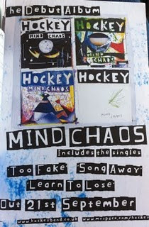
 This advert contrasts completely to The Smiths advert I looked at. This is much more current and relevant to today’s market. The almost messy presentation reflects the style of the band as well as the title of 'mind chaos' I think from looking at this it seems many adverts are based on the album that they are advertising as oppose to the band itself; the band should be recognisable in their style but it is the album they are clearly trying to sell. The image is simply the album artwork and it occupies the majority of the top half of the page. This is the most obvious way of reflecting the album as it is what represents it, I think as the image ties in well with the rest of the page it works effectively and is something I should consider using as it seems a theme that the album artwork is used in the magazine advert for this genre and possibly on a more wider scale. The same font is used consistently and is again brought through from the album artwork. It is the size of the fonts that actually vary, with the most important information being the largest and smaller details obviously smaller. The artist name is included in the image four times so clearly they did not believe including this a fifth time would be necessary allowing more space for further information. The inclusion of 'the debut album' at the top of the page would make the advert seem more appealing as again people want the new and latest bands so an new band with their first album would be something worth listening to, it encourages a neutral view from the audience as this is the first album they will have produced so do not have a reputation to fall back on as of yet. Including the singles however pulls in the audience by recognition. As a new band, the artist themselves may be less recognised than the songs so including the single names would attract an audience that recognises them. Highlighting the release date is also important (we can see this from the bigger size) because it is what they want the audience to remember, they want them to go out and buy it so this is essential information I will be sure to include. Also the use of website information seems to be used on many adverts so this is something else to consider.
 Monday, 10 October 2011
Magazine Advert Analysis
 This advert contrasts completely to The Smiths advert I looked at. This is much more current and relevant to today’s market. The almost messy presentation reflects the style of the band as well as the title of 'mind chaos' I think from looking at this it seems many adverts are based on the album that they are advertising as oppose to the band itself; the band should be recognisable in their style but it is the album they are clearly trying to sell. The image is simply the album artwork and it occupies the majority of the top half of the page. This is the most obvious way of reflecting the album as it is what represents it, I think as the image ties in well with the rest of the page it works effectively and is something I should consider using as it seems a theme that the album artwork is used in the magazine advert for this genre and possibly on a more wider scale. The same font is used consistently and is again brought through from the album artwork. It is the size of the fonts that actually vary, with the most important information being the largest and smaller details obviously smaller. The artist name is included in the image four times so clearly they did not believe including this a fifth time would be necessary allowing more space for further information. The inclusion of 'the debut album' at the top of the page would make the advert seem more appealing as again people want the new and latest bands so an new band with their first album would be something worth listening to, it encourages a neutral view from the audience as this is the first album they will have produced so do not have a reputation to fall back on as of yet. Including the singles however pulls in the audience by recognition. As a new band, the artist themselves may be less recognised than the songs so including the single names would attract an audience that recognises them. Highlighting the release date is also important (we can see this from the bigger size) because it is what they want the audience to remember, they want them to go out and buy it so this is essential information I will be sure to include. Also the use of website information seems to be used on many adverts so this is something else to consider.
Subscribe to:
Post Comments (Atom)
No comments:
Post a Comment